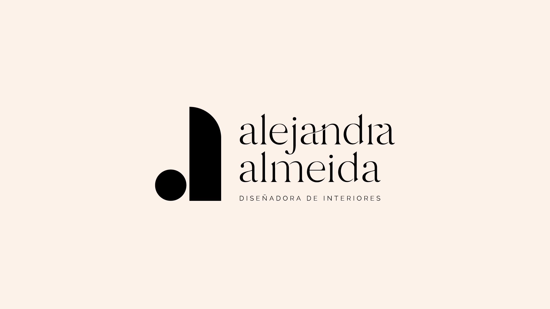
Alejandra Almeida
Brand
2021
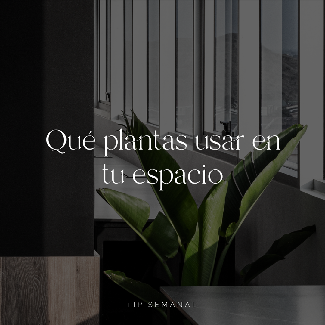
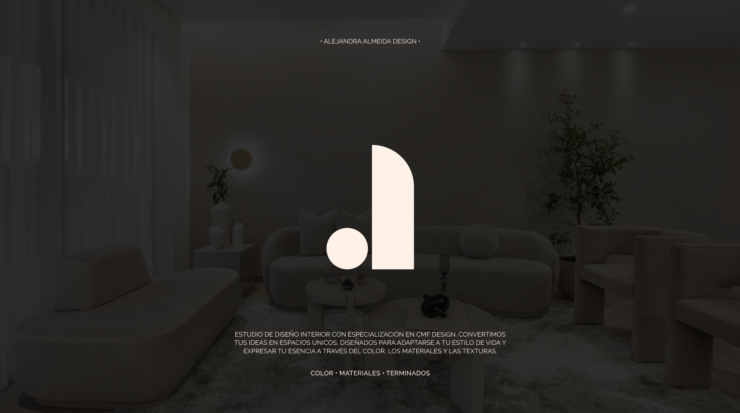
An Interior Design Studio centered on a thoughtful exploration of materials, color, and finishes.
The branding was developed to reflect the essence of Alejandra’s architectural approach: clean, intentional, and detail-oriented.
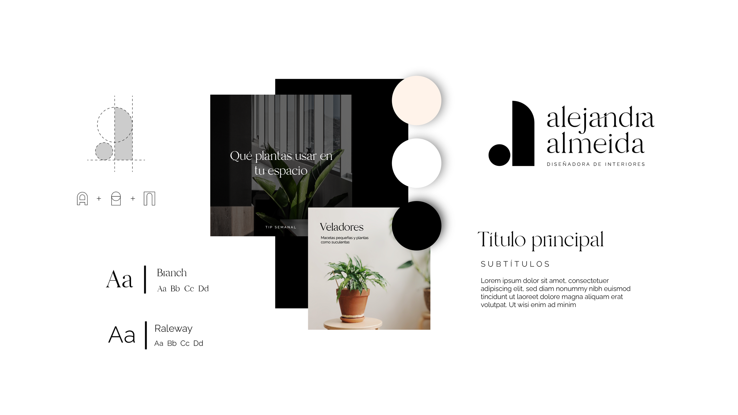
Concept
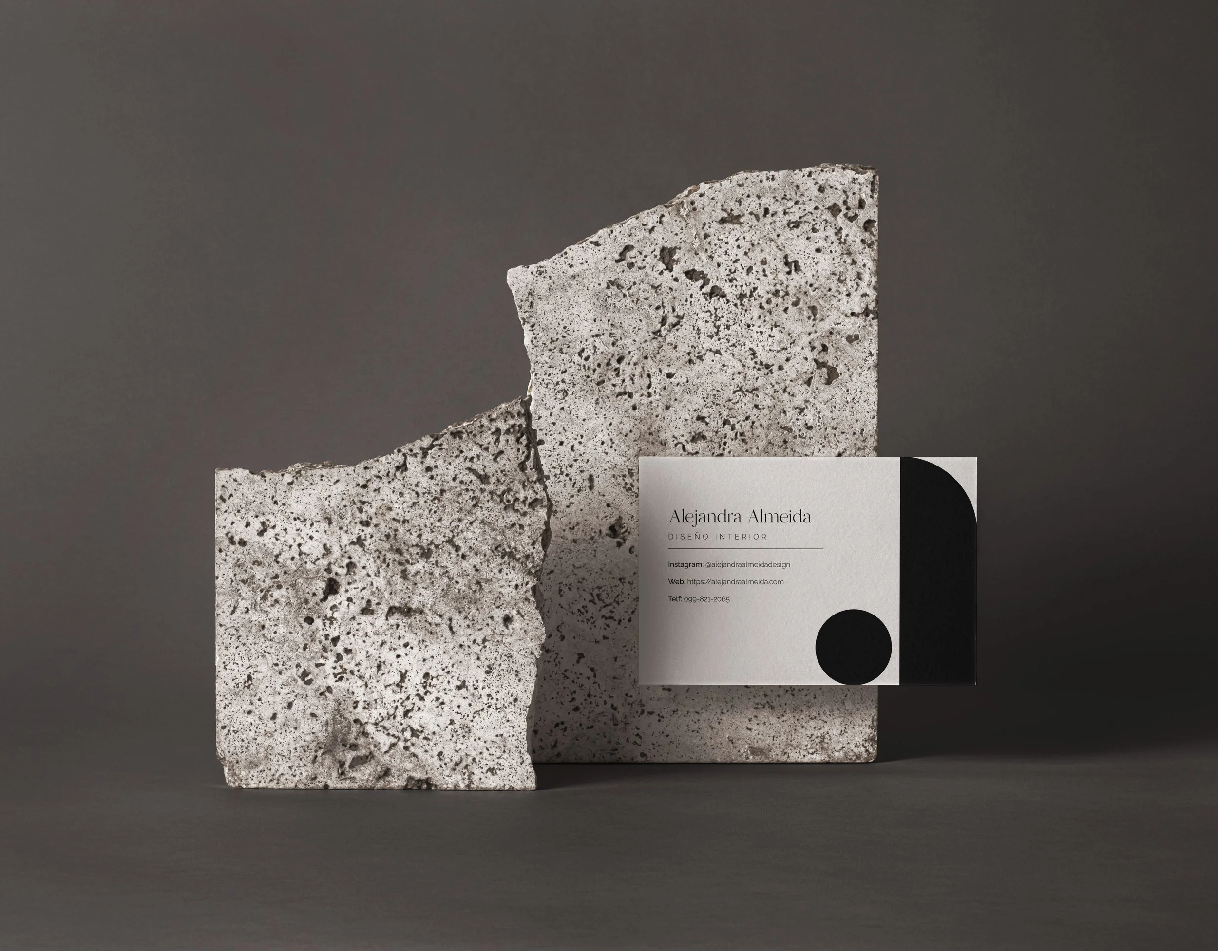
The logo is an abstraction of the letter “A”, inspired by Alejandra’s use of geometry and semicircular arches, combining a half arch and a circle to reflect her architectural approach.
The typographic system balances the elegance of a high-contrast serif with ligatures, echoing her original script style, with a clean sans-serif to ensure clarity and modernity.